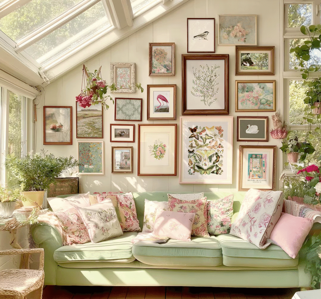
Cottagecore gallery walls offer a nostalgic, story-filled way to decorate your home using thrifted vintage decor, sentimental finds, and art collected over time. This guide walks you through curating and styling a cottagecore gallery wall that feels warm, personal, and budget friendly.
Curating Cottagecore Gallery Walls with Thrift Finds
A successful cottagecore gallery wall begins long before anything touches the wall. It starts with the way you look at thrift stores, flea markets, and antique malls. Instead of hunting for a single perfect piece, you are gathering a small world of objects that share a feeling: soft, nature inspired, and a little bit nostalgic. Look for pieces that could have belonged to a beloved grandparent, lived in a country cottage, or been passed down through many hands. In my experience working with clients, pieces with visible age such as crazing in ceramic glazes or worn gilding on frames tend to add the most character without feeling staged.
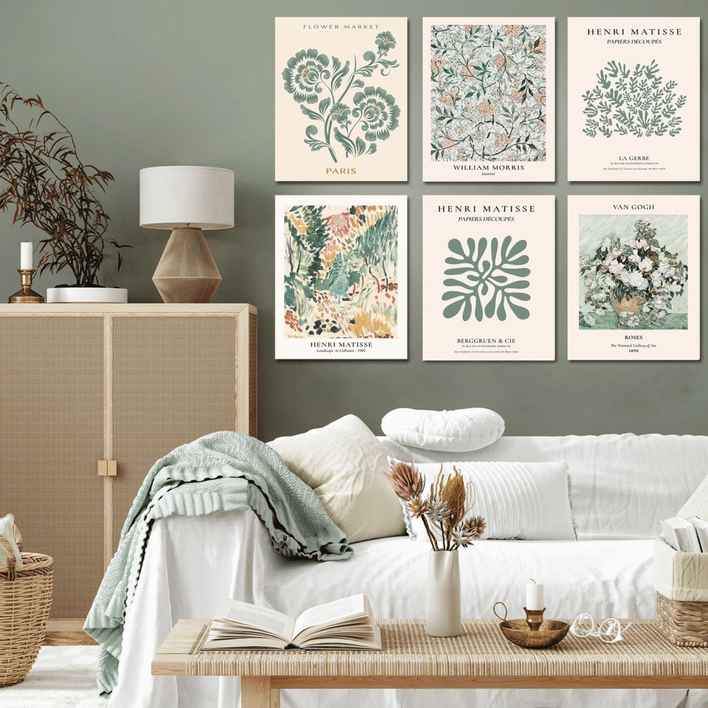
Focus on a loose color story so your gallery wall remains calm rather than chaotic. Cottagecore decor often leans into tones like cream, warm white, sage, dusty rose, muted gold, and soft browns. As you thrift, mentally group finds by color: floral prints with similar backgrounds, landscapes in comparable palettes, frames in related wood tones. You do not need perfect matches, just harmony. This reduces visual noise and keeps the wall grounded, even when the art itself is eclectic.
When curating, also think about scale and variety. Aim for a mix of:
- Small, detailed pieces such as pressed flowers or miniature portraits
- Medium prints like botanical illustrations or pastoral scenes
- One or two slightly larger anchors such as a vintage oil painting or ornate mirror
From hands-on projects, I have found that having at least one larger piece keeps a cottagecore gallery wall from feeling like a random pinboard and gives the arrangement a clear focal point.
Layering Vintage Art, Frames, and Textures on a Budget
Layering is at the heart of cottagecore style, and you can achieve it affordably with thoughtful choices. Start by mixing frame styles within a cohesive palette. Combine carved wood frames, thin brass frames, chippy white frames, and even a few simple black or dark wood frames to ground the wall. The key is to repeat each frame type at least two or three times so nothing looks like an outlier. Based on my past work with clients, repeating frame finishes allows even wildly different pieces to feel intentional and curated.
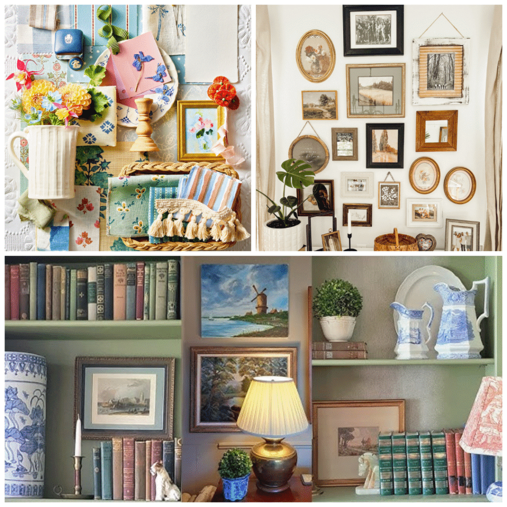
Texture is just as important as color. Include items that introduce fabric, paper, and natural materials. For instance, you might mix:
- Framed lace or antique handkerchiefs
- Vintage botanical pages or sheet music mounted on cardstock
- Woven baskets or small wicker trays
- Embroidery hoops with cross stitch or linen
These softer elements break up the hard edges of frames and contribute to that layered, cottagecore coziness. Choosing secondhand textiles and papers is typically safe, though if pieces smell strongly of mildew or smoke, allow them to air out thoroughly or skip them to avoid lingering odors in your home.
To stay on budget, look for frames separate from their art, then swap in your own prints or photographs. Thrift shop frames are often far cheaper than buying new, especially in larger sizes. In my experience designing gallery walls, a mix of 60 to 70 percent thrifted frames with 30 to 40 percent low cost prints or DIY art usually creates the richest, most dimensional look for the least money.
Defining Your Cottagecore Color Palette and Mood
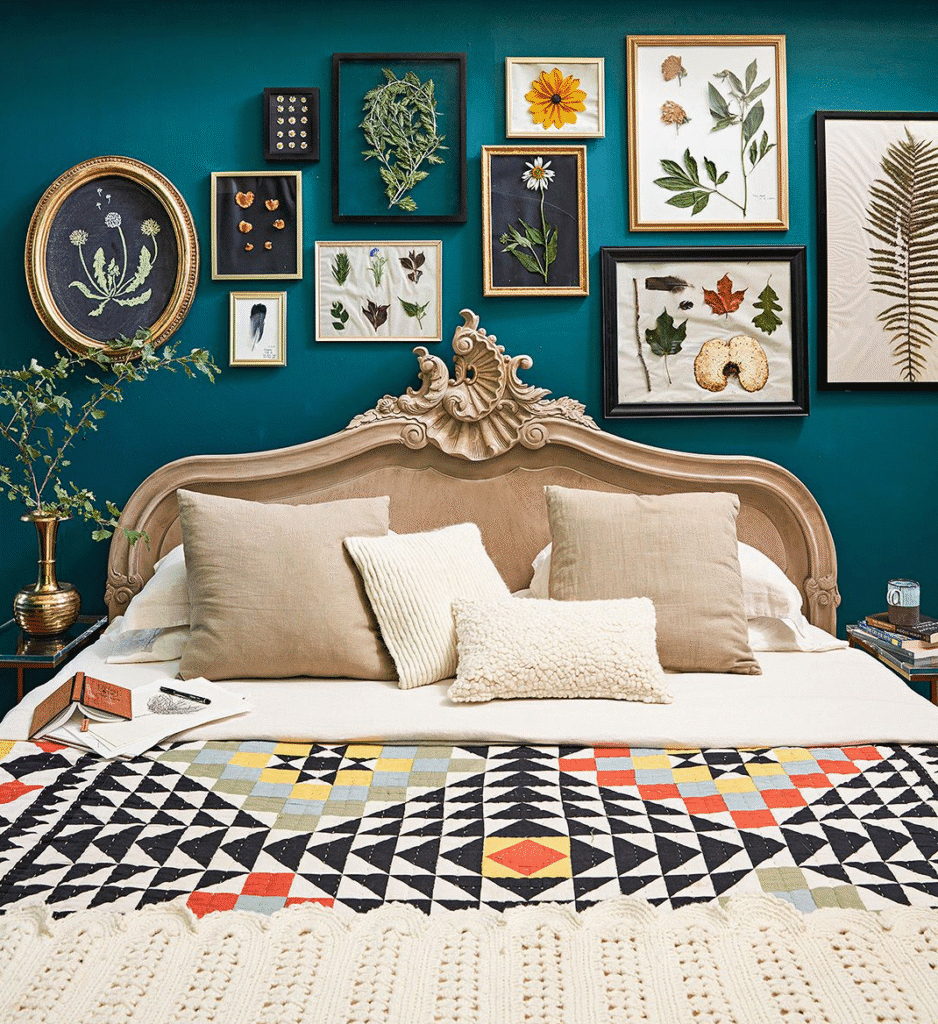
Before you start hanging, define the specific cottagecore mood you want: bright and airy, dark and moody, or soft and romantic. Cottagecore is a broad aesthetic that can shift from cream and light oak to deep greens and aged brass. Deciding on your direction makes every thrifting decision easier. For a classic cottagecore gallery wall, think sunlit farmhouse rather than grand manor: gentle tones, natural light, and soft contrast.
Choose two or three main colors and one or two subtle accents. For example:
- Main colors: warm white, sage, honey wood
- Accents: dusty rose, muted gold
Use these as a filter when thrifting. Ask yourself if each item supports or distracts from the palette. In my experience, a restrained color story allows you to mix a wider range of subject matter such as animals, florals, and landscapes without losing cohesion. If something feels off but you love it, remember that paint and matting can transform a frame to fit your palette.
Mood also comes from subject matter. Cottagecore gallery walls shine with art that celebrates nature and everyday calm. Look for:
- Botanical prints, wildflower illustrations, and herb studies
- Rural landscapes, cottages, fields, and woodland scenes
- Vintage still lifes of fruit, teacups, books, and textiles
You do not need everything to be explicitly “cottagecore” by label. From hands-on work with vintage collections, I have found that old book plates, children’s illustrations, and even faded postcards often fit the mood beautifully once framed and grouped with care.
Sourcing Thrifted Vintage Decor Like a Pro
Thrifting for cottagecore decor is easier when you know where to look and what to prioritize. Start at local charity shops, antique malls, estate sales, and community markets. Each source has its own strengths. Thrift stores are great for low cost frames and oddities, while antique malls often have better preserved artwork and unique mirrors. Estate sales can be goldmines for cohesive sets of frames, needlework, and vintage prints that all come from a single household.
Arrive with a short checklist so you do not get overwhelmed:
- Frames in varied sizes within your chosen palette
- Small mirrors with interesting shapes
- Linens, lace, or embroidered pieces for framing
- Old books with beautiful pages to repurpose
- Decorative objects like brass keys, candlesticks, or tiny plates
Based on real world searching, I recommend checking the back of framed art for information about the artist or print. You may occasionally find something valuable, in which case either keep it as is or research resale options instead of altering it. For most mass produced vintage prints, however, it is safe and ethical to reuse the frames or update the artwork.
Inspect for damage with a practical eye. A little wear is welcome in cottagecore decor, but mold, severe water damage, or flaking lead paint are safety concerns. If you suspect older paint might contain lead, particularly on heavily chipped furniture or frames, avoid sanding it yourself and consider leaving it behind. In my experience, there are always plenty of safer alternatives that still offer patina and charm.
Planning Your Gallery Wall Layout Before You Hang
A cottagecore gallery wall might look organic, but a good layout rarely happens by accident. Clear a large area on the floor and arrange all your potential pieces before making a single hole in the wall. Start with the largest item at or just above eye level, then gradually build outward using medium pieces, finishing with the smallest items. This central anchor creates balance and helps you avoid a lopsided arrangement.
Maintain consistent spacing to keep the wall from feeling cluttered. A gap of about 2 to 3 inches between frames works well for most residential spaces and allows each piece to breathe. For taller walls or oversized pieces, you can stretch this to 3 to 4 inches. From hands-on projects, I have found that equal spacing creates a professional look even when the collection itself is rustic and collected over time.
Take photos of each layout variation with your phone so you can compare them. Look for:
- Even distribution of colors and darker frames
- Repetition of shapes such as circles, rectangles, and ovals
- A gentle diagonal flow rather than strict symmetry
Once you are satisfied, trace each piece on kraft paper or newsprint, label the tracings, and tape them to the wall. This low cost step allows you to fine tune the height and arrangement in real time without creating unnecessary holes. Based on my past work with clients, this paper template method reduces errors significantly and speeds up the installation process.
Mixing Art, Objects, and Sentimental Pieces
What makes a cottagecore gallery wall feel personal rather than staged is the inclusion of meaningful items. Combine thrifted finds with family photographs, handwritten recipes, or small heirlooms. A framed recipe card from a grandparent, a tiny cross stitched sampler from a relative, or a vintage key from an old house instantly deepens the story your wall tells. In my experience working on similar projects, these sentimental elements are often the pieces people linger over the longest.
Think beyond flat art. Objects you can safely mount or hang include:
- Small wicker baskets or shallow trays
- Decorative plates with floral or pastoral motifs
- Vintage cutting boards or bread boards (away from direct cooking areas)
- Old clocks, barometers, or weathered tools
To avoid visual heaviness, scatter three dimensional pieces throughout the arrangement rather than clustering them all in one area. Make sure heavier items are properly anchored using wall plugs or appropriate hardware for your wall type. For safety, always verify the weight rating of hooks and anchors before hanging especially over beds or seating.
Balance personal items with thrifted decor so the entire wall does not feel too precious. From hands-on work with clients, I have found that a ratio of roughly 40 percent sentimental pieces to 60 percent vintage or thrifted decor keeps the display both meaningful and visually flexible. You can then swap out thrifted art seasonally without disturbing your core memories.
Styling Around the Gallery Wall for a Complete Cottagecore Look
Your cottagecore gallery wall will feel more integrated if the surrounding room supports the same mood. Style the nearby furniture, textiles, and lighting to echo the colors and textures in your artwork. A slipcovered chair in natural linen, a floral cushion, or a crochet throw can gently repeat hues from your prints and frames. This repetition ties the wall to the rest of the space and prevents it from feeling like an isolated feature.
Add a small console table, dresser, or shelf beneath the gallery wall if space allows. Style it with:
- Stacks of old books and a ceramic pitcher with seasonal flowers
- A mix of brass candlesticks with beeswax or unscented candles
- A lace runner, doily, or vintage cloth for softness
- A basket with knitting, letters, or neatly folded linens
For lighting, use warm white bulbs around 2700K to 3000K in table lamps or wall sconces. Cooler color temperatures can make vintage art look flat or harsh, while warmer light enhances patina and makes colors appear richer. Based on real world testing, even a single lamp placed nearby can give your gallery wall a cozy, storybook glow in the evening.
Plants also enhance cottagecore decor, but choose them according to your home’s light levels and your ability to maintain them. Low light tolerant options such as pothos or philodendron do well away from windows, while herbs and flowering plants need more sun. Plants improve the overall feel of the space but are not substitutes for proper ventilation or air filtration. In my experience, a trailing plant draped near a frame or shelf instantly softens the geometry of the wall.
Maintaining, Refreshing, and Evolving Your Gallery Wall
A cottagecore gallery wall is not a static museum display. It can and should evolve with seasons, travels, and new thrift finds. Make it a habit to step back every few months and assess how it feels. You might swap in a floral print for spring, a woodland scene for autumn, or add a new family photo after a special event. Keeping a small box or drawer dedicated to “rotation pieces” makes updates simple and low stress.
Maintenance primarily involves dusting and protecting your art from damage. Use a soft, dry cloth to gently dust frames and objects. Avoid liquid cleaners on older wood or gilded finishes, as moisture can damage delicate surfaces or loosen joints. If any item shows signs of mold growth or insect activity, remove it immediately and inspect nearby pieces. From hands-on work with vintage decor, I have found that sunlight and good air circulation greatly reduce the risk of mustiness, but direct, intense sun can fade artwork over time, so aim for indirect light when possible.
Do not hesitate to edit. Over time, you may outgrow certain pieces or realize that specific items never quite fit the palette. Donate, gift, or repurpose them instead of forcing them to stay. In my experience working on similar projects, periodic editing keeps a gallery wall feeling intentional and prevents visual overload. The goal is a living, breathing collection that reflects your life and values, not a rigid composition you are afraid to change.
Conclusion
A cottagecore gallery wall created with thrifted vintage decor is more than a design project; it is a gentle, ongoing story of what you love, value, and find beautiful in everyday life. With thoughtful sourcing, simple layout planning, and a willingness to let the collection evolve, you can build a wall that feels both timeless and deeply personal without stretching your budget.
By curating pieces with shared color palettes and natural themes, mixing frames and textures, and layering in meaningful objects, you create a warm focal point that anchors any room. Based on real world projects, the most successful cottagecore gallery walls are those that embrace imperfection: a slightly crooked frame, a nicked edge, or a faded corner often adds as much charm as the art itself. Trust your eye, make small changes as you live with the wall, and let your cottagecore space grow slowly, just like a well tended garden.

Maira Lindey is a home decor enthusiast who loves transforming ordinary spaces into warm, stylish havens. Through her writing, she shares simple, creative ideas that help people make their homes both beautiful and comfortable. Her approach combines aesthetic charm with practical solutions for everyday living.
With years of experience experimenting with colors, textures, and layouts, Maira enjoys guiding readers to express their personality through home design. She believes that even small changes can have a big impact, and she focuses on tips that are easy to implement without overwhelming the space or the budget.
Beyond decorating, Maira finds inspiration in nature, art, and everyday life. She encourages her readers to embrace creativity and make spaces that feel uniquely theirs, blending functionality with style in ways that are both inviting and livable.