A chic gallery wall can transform a blank space into a curated focal point without straining your budget. With thoughtful layouts, affordable frames, and creative DIY art, you can build a stylish gallery wall that looks intentionally designed and uniquely personal.
Gallery walls are one of the most cost effective ways to give your home a polished, magazine worthy look. By planning your layout, mixing frame styles, and using budget friendly prints and DIY art, you can create a chic display that feels just as elevated as high end designer walls for a fraction of the cost.
Curated Layouts for Chic Budget Gallery Walls
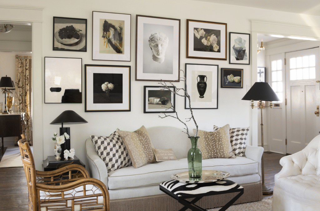
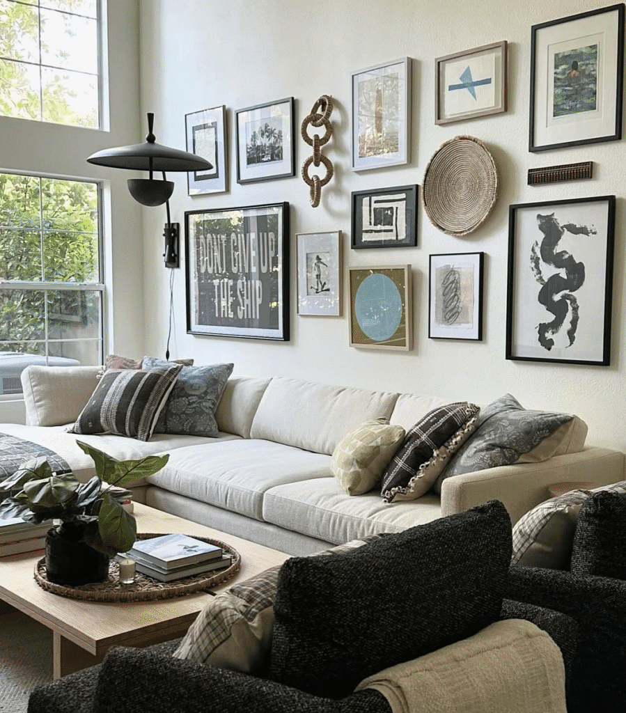
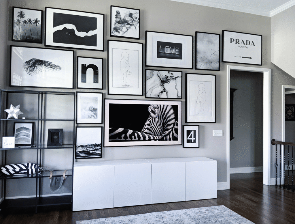
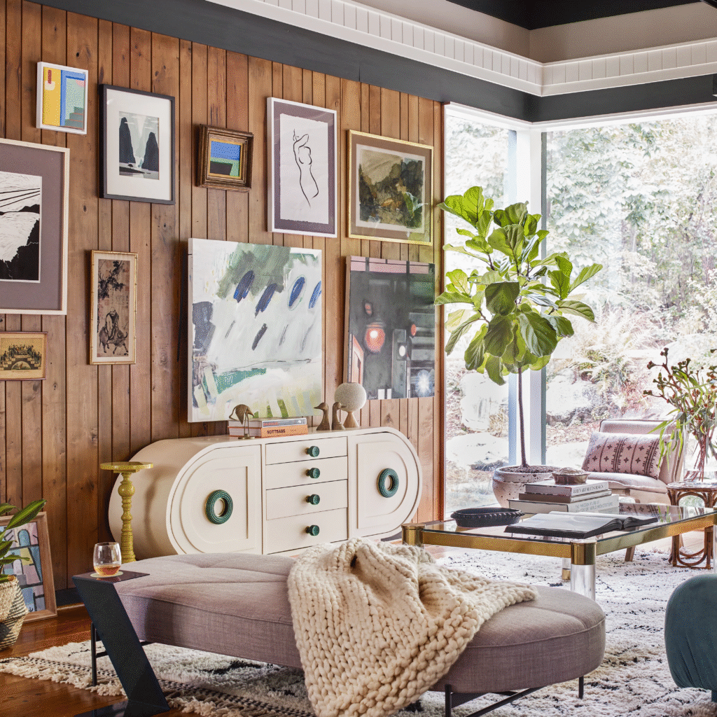
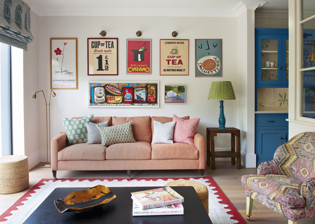
A polished gallery wall always starts with a clear layout, especially when you want a chic look on a budget. Before buying a single frame, decide what kind of arrangement fits your room: a grid, a salon style cluster, or a linear row. A grid layout with equally sized frames feels clean and modern, while a mixed collage layout with different sizes feels more collected and relaxed. It can help to choose a layout that echoes your home’s architecture, such as aligning a gallery to the height of a doorway or the width of a sofa.
From hands-on work with clients, I have seen that the biggest difference between a “cluttered” wall and a “curated” wall is breathing room. Aim for consistent spacing between frames, usually about 2 to 3 inches apart, so the display feels intentional rather than crowded. Use painter’s tape on the floor or wall to map out your arrangement before making any holes. This planning stage prevents unnecessary patching later and helps you see if your gallery wall really fits the scale of the room.
For a chic budget gallery wall, anchor your layout with one or two slightly larger pieces. These do not need to be expensive artworks; a large black and white photo or an inexpensive over-sized print can serve as the visual center. Surround that anchor with smaller frames to guide the eye across the wall. A few layout ideas that often work well include:
- A balanced grid of 6 to 12 frames for a minimalist look
- A centered focal piece with asymmetrical smaller frames around it
- A horizontal line of frames that follows the top of a sofa or console
Planning Around Furniture, Sightlines, and Room Flow
The most successful budget gallery walls are designed in context with furniture and sightlines rather than floating randomly. Start by choosing one key wall, such as the one behind your sofa, along a staircase, or above a console table. A good rule of thumb is to keep the center of the entire gallery wall around 57 to 60 inches from the floor, roughly at eye level for most adults. This museum inspired guideline keeps your artwork feeling grounded and comfortable to look at.
In my experience working on living room makeovers, aligning the bottom of a gallery wall about 6 to 8 inches above the back of a sofa or console creates a cohesive visual connection. If you hang everything too high, the wall looks disconnected from the furniture; too low and the wall can feel heavy. When working with stairs, follow the incline of the steps with your frames, keeping an imaginary diagonal line that moves upward with each step.
Room flow also matters for a chic look. Think about what you first see when you enter a room and how your eye will move. Place your most striking piece where it will meet that first sight-line, such as opposite a doorway or at the turn of a staircase. To keep the space from feeling busy, avoid placing a dense gallery wall directly behind a TV or in a narrow hallway where people need calm visual cues to move comfortably. A few helpful checks:
- Stand in doorways and see where your eye naturally lands
- Ensure doors and windows still open easily without hitting frames
- Keep at least a few blank wall areas so the home does not feel crowded
Mixing Frame Styles and Colors on a Budget
You do not need luxury frames to create a high end look. Affordable frames from big box stores, thrift shops, or online shops can look chic if you choose a cohesive color story. For a polished budget gallery wall, pick one or two frame colors such as black and light wood, or white and gold. This limited palette pulls together different shapes and sizes so the wall feels unified rather than random. Mixing matte and glossy finishes can add depth, but keep the overall palette consistent.
Based on real world testing with budget frames, I have found that simple profiles age better than ornate ones. Clean lined frames with narrow edges tend to look more expensive than overly decorative frames made from low cost materials. You can also repaint mismatched thrift-ed frames with spray paint designed for wood or metal in colors like matte black, warm white, or champagne for a quick transformation. Always spray outdoors or in a well ventilated area and follow manufacturer directions for safety and drying times.
When choosing frame sizes, use a mix to avoid monotony. Combine:
- Two or three larger frames (16×20 inches or bigger) as anchors
- Medium frames (11×14 and 8×10) to balance the composition
- A few small frames (5×7 or smaller) to fill gaps and create rhythm
From hands-on projects, I have found that about three different frame sizes are enough for visual interest without making the layout feel chaotic. If you are using many mismatched thrift-ed pieces, unify them by repeating at least one detail such as all white mats, all black frames, or all similar wood tones.
Affordable Prints, Photos, and High Impact Focal Pieces
Artwork does not need to be original or expensive to feel special. Affordable gallery wall ideas often start with printable art, personal photos, or public domain artworks that can be printed at home or at a low cost print shop. Many museums and libraries offer high resolution, copyright free artwork that you can download legally for personal use. Simply choose a few images that share a common theme such as botanicals, architectural sketches, or abstract shapes.
In my experience sourcing budget art, black and white photos are incredibly forgiving and look cohesive even when the subjects vary. You can convert your favorite phone photos to black and white and print them on matte photo paper to avoid distracting reflections. Mix these with a few bold graphic prints or typography pieces that carry meaningful words, cities, or dates. When printing at home, select higher quality settings and use decent weight paper, ideally 160 gsm or more, for a more substantial feel.
Investing in one standout print or photograph can make the entire gallery wall feel elevated. That focal piece might be:
- An over-sized vintage style travel poster
- A large scale botanical print or line drawing
- A family portrait printed in a larger format
Place this piece slightly off center rather than perfectly centered to give the layout a designer touch. Surround it with simpler, more budget friendly pieces to let it shine and stretch your overall art budget.
DIY Art Projects That Look Surprisingly High End
DIY art is one of the easiest ways to keep your gallery wall affordable and personal. You do not need advanced art skills to create pieces that look modern and stylish. Simple techniques like abstract brushstrokes, monochrome shapes, or line drawings can be very effective once framed. Use leftover wall paint, inexpensive craft acrylics, or even coffee or tea washes for subtle tones that tie into your room’s color palette.
From hands-on work with clients who felt intimidated by DIY art, I have seen that limiting your colors and shapes usually yields the most refined results. Try painting a few sheets of heavy paper with broad, curved shapes in just two or three colors, then trimming and matting them for a clean finish. Another low cost idea is to press foliage or flowers and frame them against a neutral backing. Make sure plant material is fully dried and pressed before framing to prevent moisture and mold.
Cost effective DIY art ideas that often work well include:
- Textured abstract canvases made with Spackle or joint compound (allow to dry fully before painting and hanging)
- Handwritten or printed quotes placed in simple frames
- Collages made from leftover wallpaper samples, magazines, or fabric swatches
- Minimalist line drawings traced in pencil and finished with a black pen
In my experience working on budget friendly decor projects, a mix of DIY art with printed photography and inexpensive purchased prints creates a rich, collected feel that never looks like a single store set.
Styling with Mats, Negative Space, and Visual Rhythm
Mats might be the single most powerful trick for making budget art look expensive. A wide white mat instantly gives small or simple pieces more presence. For a contemporary gallery wall, choose mats with at least a 2 to 3 inch border around the artwork. If you are reusing frames that do not come with mats, you can buy pre-cut mats or have custom sizes cut, which is often cheaper than buying new large frames.
Based on my past work with clients, I have found that including negative space inside and around your gallery wall is essential. You do not need to fill every inch of the wall. Leave a margin of at least 4 to 6 inches from nearby windows, door frames, or ceiling lines so the gallery can “breathe.” Within the composition, alternate more detailed or busy pieces with calm, minimal ones to create visual rhythm and avoid overwhelm.
A few practical styling guidelines that help create a chic, cohesive gallery:
- Repeat key visual elements such as black frames, white mats, or circular shapes at least three times across the wall
- Vary orientations so you have a mix of portrait and landscape pieces
- Avoid clustering all the dark or colorful items in one area
From real world installations, I have noticed that “stepping back” between each few pieces you hang helps maintain this balance. View the wall from across the room and adjust as needed before moving on.
Hanging Systems, Hardware, and Wall Protection on a Budget
A chic gallery wall also depends on safe, sturdy hanging methods that protect your walls, especially in rentals. For lighter frames, removable adhesive hooks or strips can work well if you follow the weight limits and instructions carefully. Always clean the wall surface and allow it to dry before applying adhesive. For heavier frames or glass front pieces, traditional picture hooks anchored into the wall are safer and more secure.
In my experience working with renters and homeowners, a simple picture hanging kit with various hooks, nails, and wire often covers most needs. For drywall, using hooks that angle into the wall usually provides more support than a single nail. If you are dealing with plaster or unknown wall types, consider using a stud finder and appropriate anchors, or consult a professional for very heavy pieces. Safety is important when hanging art above beds, cribs, or seating areas, so err on the side of stronger hardware.
To keep your layout flexible without creating too many holes:
- Use picture ledges to display several pieces that can be swapped easily
- Run a slim rail or molding and hang frames from hooks and cords for an adjustable, European style look
- Choose lightweight frames with acrylic fronts instead of glass when possible, especially in children’s areas
From hands-on projects, I have found that measuring and marking lightly with a pencil, then using a small level or level app, will significantly reduce crooked frames and extra holes. Taking ten extra minutes here pays off in a cleaner, more professional looking gallery wall.
Refreshing and Evolving Your Gallery Wall Over Time
A budget gallery wall does not have to stay static. One of the advantages of using affordable pieces and a cohesive frame system is the ability to refresh the display as your taste, family photos, or seasonal decor change. You can swap out prints in existing frames instead of starting from scratch, which keeps costs low and reduces waste. Keeping a small folder or box labeled “gallery extras” for backup prints makes seasonal switches easy.
From my experience maintaining gallery walls for clients, a yearly refresh keeps the wall feeling current and personal. This might mean adding a new travel photo, updating a child’s artwork, or rotating in a bold color piece when you change pillows or rugs. If the layout is well planned, you can usually replace individual pieces without disturbing the overall flow. Try to keep the visual weight balanced when you change items, so one side does not suddenly feel much darker or busier than the other.
A few low cost ways to evolve your gallery wall include:
- Introducing a new accent color through one or two prints
- Swapping older frames for a couple of thrift-ed finds painted to match
- Adding a small three dimensional item, such as a woven basket or decorative plate, for texture
In my experience working on long term home projects, treating your gallery wall as a living, evolving feature rather than a finished product helps it stay meaningful and stylish for years.
Conclusion
A chic budget gallery wall comes down to smart planning, cohesive frames, and creative art choices rather than high price tags. By combining curated layouts, affordable prints, thoughtful DIY projects, and safe hanging methods, you can turn any blank wall into a stylish, personal focal point that grows with you over time.
A well designed budget gallery wall proves that style is more about intention than expense. When you anchor your display to your furniture, follow sensible height and spacing guidelines, and limit your color and frame palette, the whole composition feels curated and calm. Adding in thoughtful details like generous mats, negative space, and a few standout focal pieces elevates every low cost element.
From hands-on work with clients and personal projects, I have seen that the most loved gallery walls are the ones that tell a story. Mix personal photos, travel mementos, vintage finds, and DIY art that reflects your life and tastes. With each small decision, you craft a custom, high impact feature that makes your home feel finished, inviting, and uniquely yours, all while staying comfortably within budget.

Maira Lindey is a home decor enthusiast who loves transforming ordinary spaces into warm, stylish havens. Through her writing, she shares simple, creative ideas that help people make their homes both beautiful and comfortable. Her approach combines aesthetic charm with practical solutions for everyday living.
With years of experience experimenting with colors, textures, and layouts, Maira enjoys guiding readers to express their personality through home design. She believes that even small changes can have a big impact, and she focuses on tips that are easy to implement without overwhelming the space or the budget.
Beyond decorating, Maira finds inspiration in nature, art, and everyday life. She encourages her readers to embrace creativity and make spaces that feel uniquely theirs, blending functionality with style in ways that are both inviting and livable.